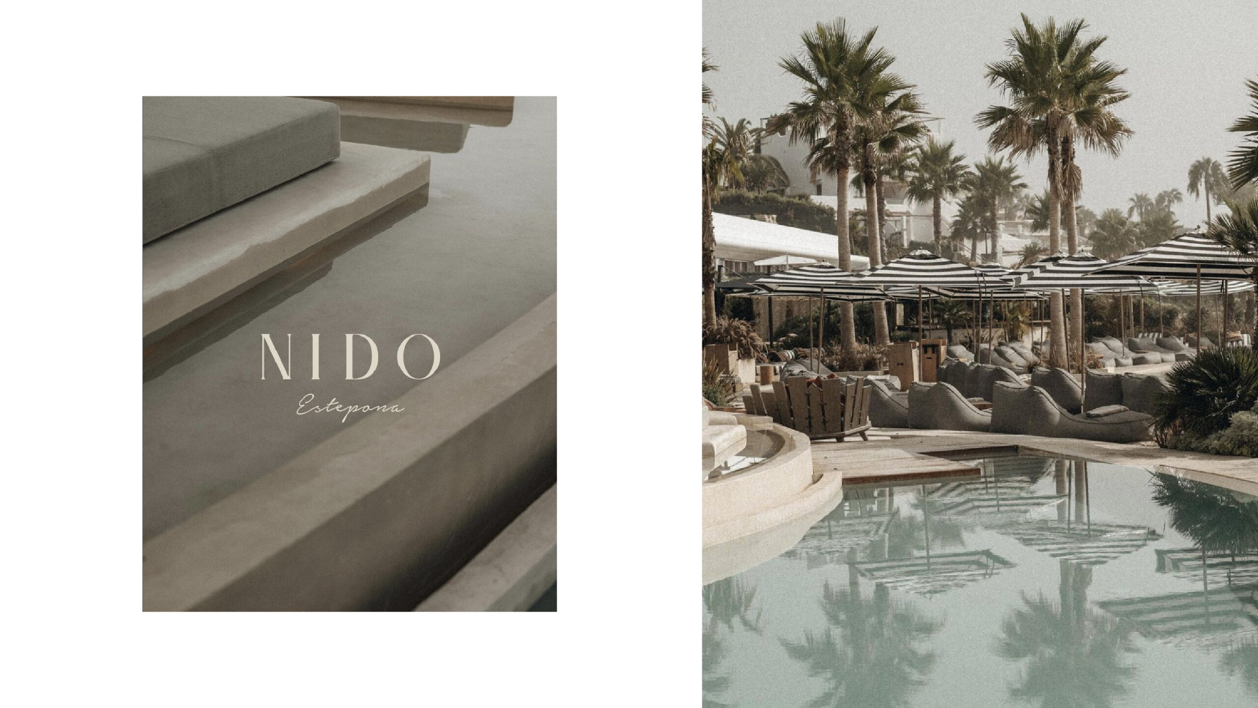
Nido Estepona
Company: Nido Estepona
Sector: FnB & Luxury Hospitality
Services: Brand Identity
The Challenge
The client, a modern beach club, lounge, and restaurant, needed a distinctive brand identity that encapsulated its unique atmosphere and coastal location. Collaborating with the Marbella-based agency Cool Marbelous, we aimed to create a logo that would visually represent the essence of Nido, drawing inspiration from contemporary architecture and the venue’s namesake, “Nido,” meaning “Nest” in Spanish. The challenge was to design an emblem that not only reflected the beach club’s modern aesthetics but also conveyed a sense of community, simplicity, and empowerment associated with the symbolism of a nest and sparrows.
The Result
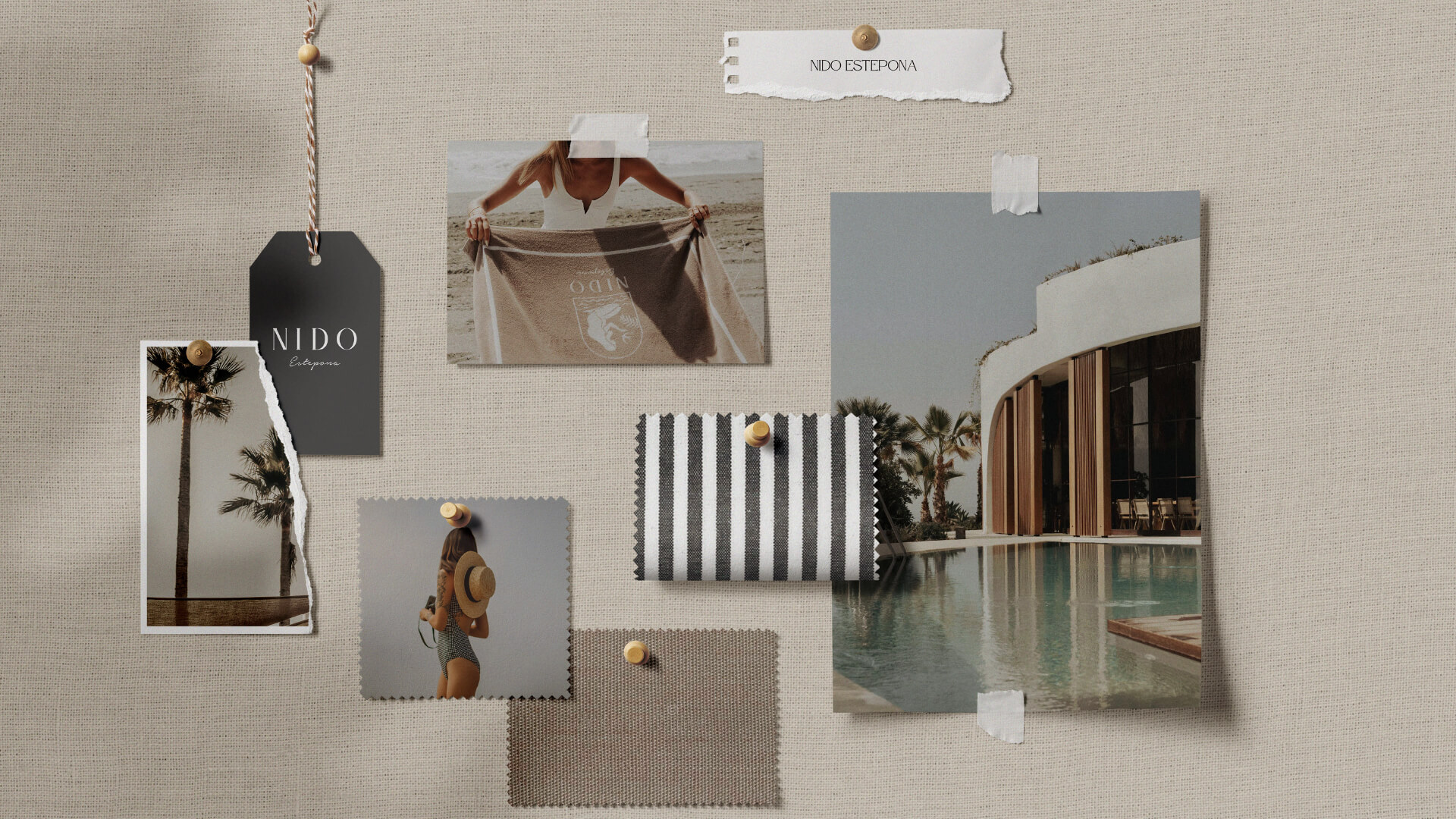
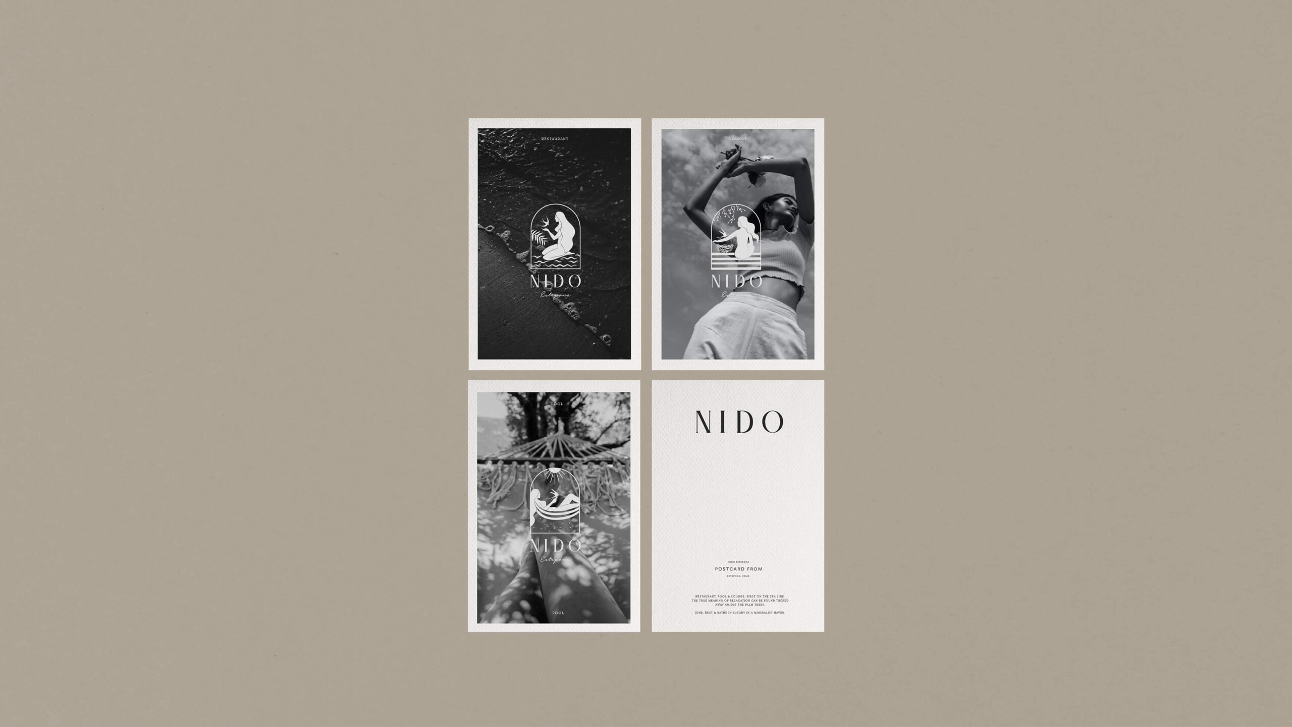
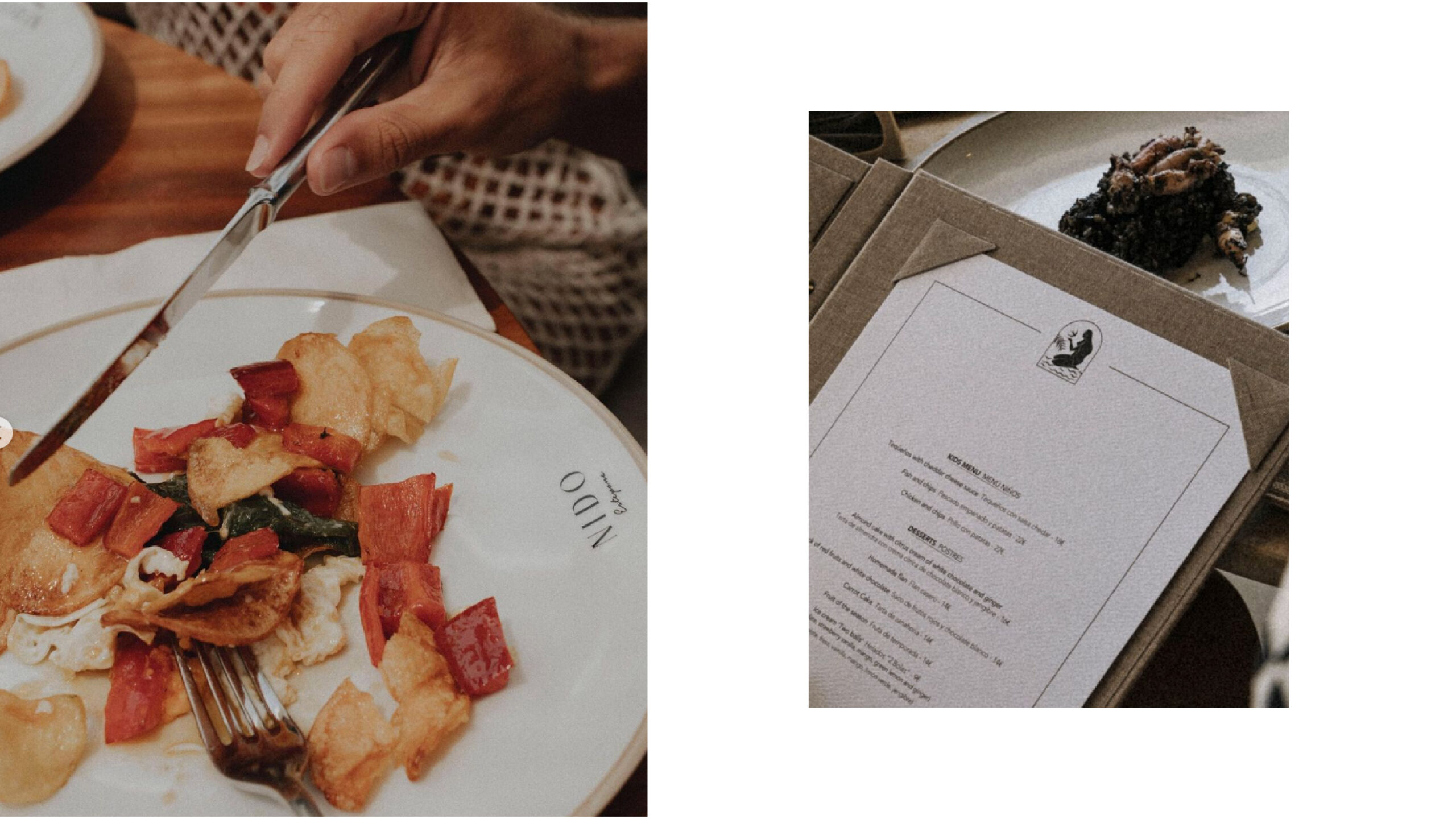
We adopted an illustrative approach, designing a logo featuring a half-dome shape that represents a window into Nido. Through this window, we depicted a woman embracing a sparrow, symbolising power, creativity, community, simplicity, and empowerment, while she sits on a bed of water, representing the club’s proximity to the beach. The colour palette of neutral and sandy tones was chosen to match the beach club’s aesthetic. Additionally, we created two more iterations of the logo to highlight the distinct identities of the venue’s restaurant and lounge. This cohesive and meaningful branding successfully captured the spirit of Nido, creating a strong visual identity that resonates with its clientele.
Category:
Date:
September 22, 2023

