Renegade Global
Company: Renegade Global with Amy Jo Martin
Sector: Business Coaching
Services: Brand Identity
The Challenge
The client – renown author, speaker and founder Amy Jo Martin – viewed the diamond as a significant symbol, making it essential to incorporate this shape into the Renegade Global icon in a meaningful way. The challenge was to reimagine the diamond to reflect the synergy between the different segments of the Renegade Company (Corporate, Accelerator, Collective), each contributing to empowering future and existing leaders. Additionally, the branding needed to incorporate a unique wordmark that was distinctly Renegade while balancing approachability with boldness.
The Result
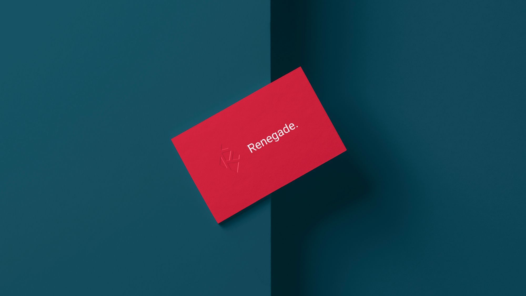
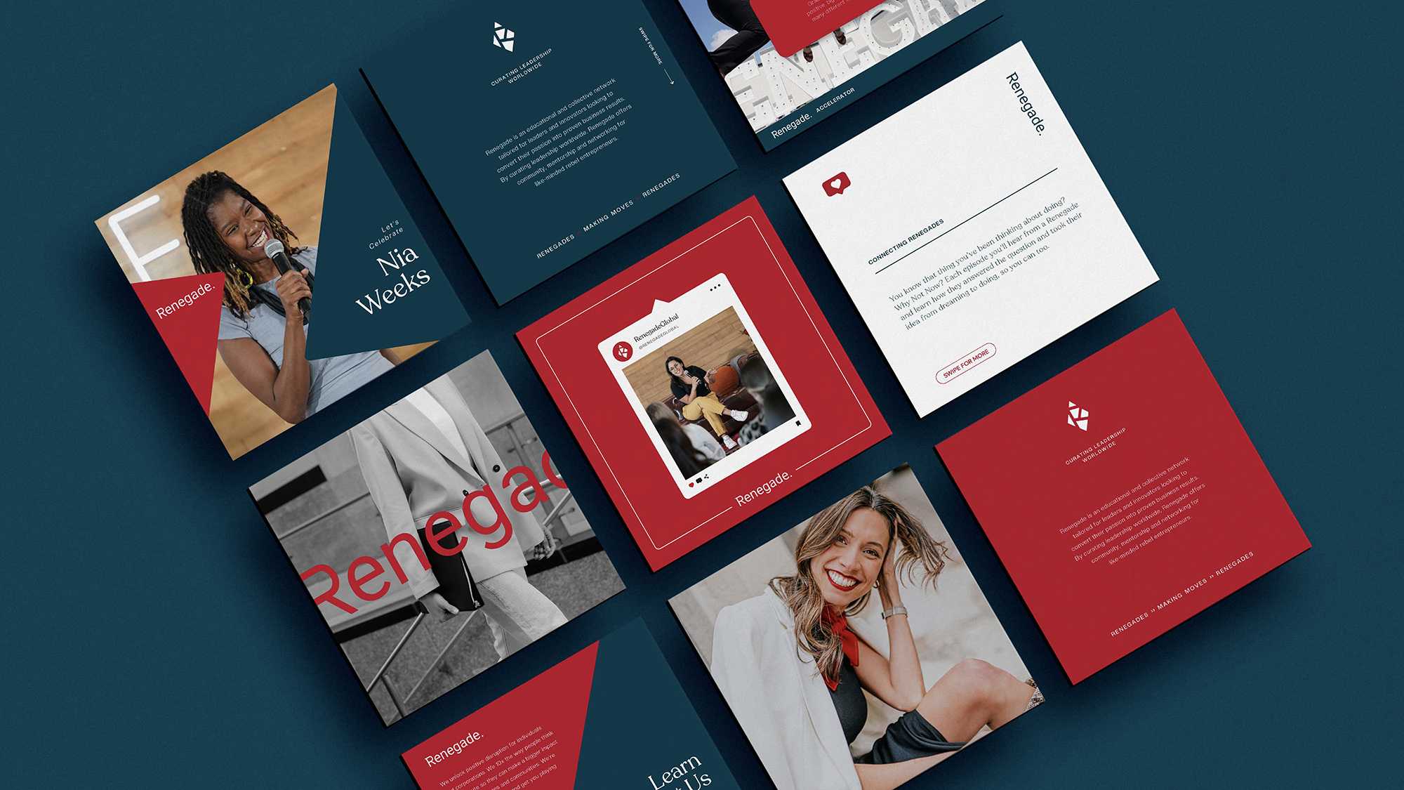
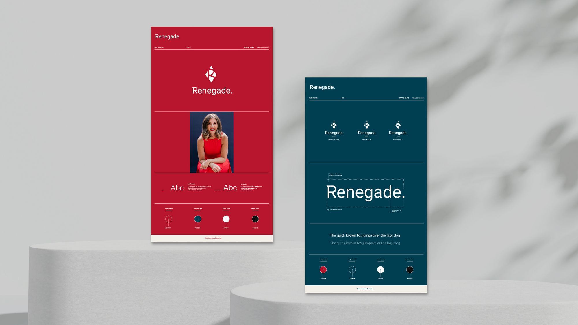
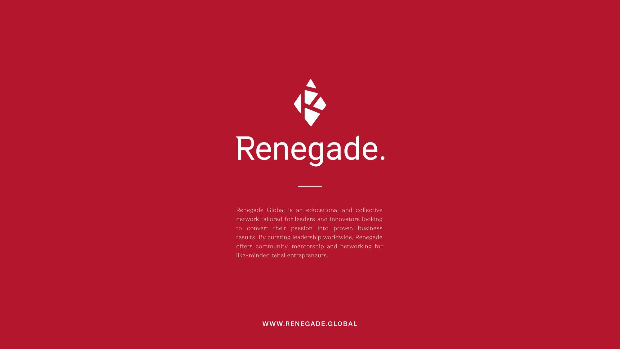
The diamond was segmented into a mosaic, symbolising the harmony between the various parts of Renegade Global, with the letter ‘R’ remaining central in the design. The wordmark was customised with unique nicks and folds, creating a distinctive and perfectly Renegade look. The font style was chosen to be approachable yet bold, complementing the angular and structured emblem. This interplay between the emblem and the wordmark established a cohesive brand identity. The colour palette featured a twist on traditional red and a commanding teal tone. Teal, being both corporate-friendly and trendy, offers the calming properties of blue and the renewal qualities of green. Red, a signature colour for the client, symbolises boldness and bravery, reinforcing the brand’s core values
Category:
Date:
September 22, 2023


